By Miles Fischman, student of Vexillology
There are five basic principles of flag design, as detailed in Good Flag, Bad Flag, compiled by Tim Kaye. These principles are useful and important in making a meaningful, aesthetically pleasing flag. They are:
- Keep It Simple. The flag should be so simple that a child can draw it from memory.
- Use Meaningful Symbolism. The flag’s images, colors, or patterns should relate to what it symbolizes.
- Use 2 or 3 Basic Colors. Limit the number of colors on the flag to three which contrast well and come from the standard color set.
- No Lettering or Seals. Never use writing of any kind or an organization’s seal.
- Be Distinctive or Be Related. Avoid duplicating other flags, but use similarities to show connections.
Keep in mind that these principles are not strict rules, but recommendations on how to go about making your flag. If you want to break them you certainly can, but be careful because while there are many flags that broke these principles and succeeded, there are also many that failed. Let’s now explore each principle and look at flags that followed that principle well, those that broke it and utterly failed, and those that broke it and still looked good.
1. Keep It Simple
The flag should be so simple that a child can draw it from memory.
There are a few reasons for this; the first being production costs. It costs a lot more to make a super complicated flag than it does to make a simple one. Simple flags also look way better ninety-eight percent of the time, and they’re more easily recognizable.

The German flag is simple, memorable, easy to draw, and fits in with most of the other flags of European countries.
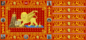
The flag of the former Republic of Venice is, to put it very lightly, far too complex. It was already too complicated with the lion. Adding the detailed embroidery and patterns, the depiction of several animals and human figures, and the illustration of Biblical characters, and this flag is an insult to the eyes, not even considering how much money it would cost to make it. If you want to put animals or people on your flag, avoid going into detail and make them the focus of your flag.
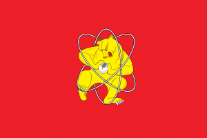
The flag of Zheleznogorsk, a once-secret Russian city founded to make weapons-grade plutonium in 1950, features a bear, the national animal of Russia, tearing apart an atom. This definitely breaks the simplicity rule, but more than makes up for it by being insanely cool. [Not to be outdone, the American equivalent of Zheleznogorsk is Richland, Washington. Their high school logo is a mushroom cloud. Their teams are called the Bombers.]
2. Use Meaningful Symbolism
The flag’s images, colors, or patterns should relate to what it symbolizes.
This one is pretty intuitive. There’s really no point to a flag that doesn’t mean anything, and there’s no chance anyone will fly it as a sign of pride. When creating your flag, make sure everything you include is significant and symbolic of something you want to convey about the place in question. Colors and shapes have certain meanings attached to them. The color red, for example, often represents bravery or fighting.
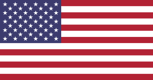
The flag of the good ol’ United States is covered in symbolism. The fifty stars represent the fifty states, all represented as equally important. The blue in the canton (top left part of a flag) represents justice. The thirteen stripes represent the original thirteen colonies, with red representing courage and white representing unity. Everything there has a purpose, and doesn’t overwhelm the viewer.
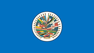
The flag of the Organization of American States definitely needs a change. The display of all the flags of the nations in the organization is far too detailed and needs to be changed anytime a country joins or leaves, or even when a country changes its flag (which some of these countries should do!). The black border around the central white circle is also unnecessary.
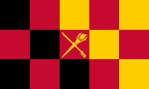
This is the flag of the Detrian Empire, a fictional country I created for a D&D setting. Believe it or not, nothing on this flag really means anything! Sure, you could say the sword represents the fighting of the country’s past, and maybe the gold represents prosperity or something, but there isn’t really much to say other than that. There aren’t many flags that don’t have meaningful symbolism that still look good because usually when creating a flag, the first thing many think of is what the flag represents, so even flags that don’t have meaningful symbolism and don’t look good are few and far between.
3. Use 2 or 3 Basic Colors
Limit the number of colors on the flag to three which contrast well and come from the standard color set.
Again, one reason for this is the cost of the flag. It costs more to produce a flag with lots of colors than it does to produce a flag with very few colors. Plus, a flag with too many colors can be overwhelming and just looks pretty bad. Make sure the colors look good together: they should contrast, but not too much. Red and blue, for example, are a pain to look at right next to each other. One way to get around that problem is to separate overly-contrasting colors with something softer, like white.

The French flag is a standard European tricolor. The blue and red are separated very nicely by the white in the center, giving us a memorable and good-looking flag.
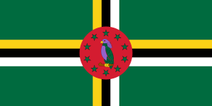
The flag of Dominica has at least seven different colors, and none of them look very good together. Plus, it’s too detailed: I bet you didn’t notice the bird’s red eye!
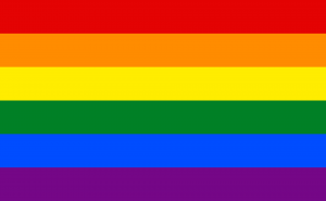
The gay pride flag uses the whole rainbow as its palette, but that’s the whole point. It represents diversity and inclusion, so there’s no better symbol to use than a rainbow.
4. No Lettering or Seals
Never use writing of any kind or an organization’s seal.
Please, please, if you learn one thing here, let it be this. Never ever use any text or seals on your flag. It looks absolutely terrible and it can’t be read if the flag is flapping or hanging from a pole.

This is one of the redesigns of the terrible flag of Milwaukee, Wisconsin, called the People’s Flag of Milwaukee. [My Dad completely disagrees. He loves Milwaukee's flag.] It replaces the text and complicated design of the original Milwaukee flag (not shown here, but you should look it up to see how not to design a flag) with this scene of the sun rising over Lake Michigan.
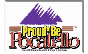
Yes, that was the real flag of Pocatello, Idaho. Yes, that is a copyright statement. Yes, that is a border. The design and the text are very low quality and look like they are supposed to be the logo for a website in 2006.
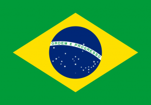
The Brazilian flag is pretty controversial. Many people find that the text ruins it, but some others, including myself, find it to be a pretty good flag. Whether the flag is good or bad, the text isn’t as noticeable as on other flags with text. The white area on which the text lies acts almost like the equator of the night sky, if that’s a thing. It’s kind of pretty, actually.
5. Be Distinctive or Be Related
Avoid duplicating other flags, but use similarities to show connections.
This connects back to the rule about using meaningful symbolism. There isn’t a place on the planet that hasn’t been influenced at some time in its history by someone with a flag. The flags of former and current colonies and territories often refer in some way to the flags of their homelands. For example, the flag of Australia features the flag of the United Kingdom in the canton (the top left corner), and the current flag of New York City features NYC’s seal on top of the old Dutch flag.
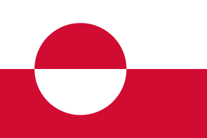
The flag of Greenland is certainly distinct. Its design is unique and separates Greenland from the other Nordic countries, whose flags all feature a design called a Nordic cross. However, the flag still manages to “be related”: its colors are the same as those on the flag of Denmark, as Greenland is part of the Kingdom of Denmark.
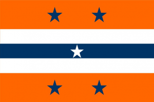
This concept for a redesign of New York City’s flag isn’t perfect, but it follows this rule quite nicely. The colors — orange, white, and blue — are carried over from NYC’s current flag, and refer to the old Dutch flag, as the Dutch were the first to colonize Manhattan (other than the Native Americans who were already there, of course). The stars are common among many flags, but can be seen as a reference to the US flag. The stripes are also reminiscent of some other American city flags, like Chicago and Washington DC.

Hey, Indonesia! Monaco called, and they want their flag back! That’s right, Indonesia’s flag is almost the same as Monaco’s flag, despite the fact that there’s no relation between them and Monaco’s flag is older. If you flip it upside down — say, if you are putting up a display of world flags and you don’t realize which side is supposed to go up — its virtually indistinguishable from Poland’s flag.
I think you get the point by now.
More Information
Parts of a Flag
- Hoist: This is the half of the flag that is closest to the flagpole, and is generally thought of as the left side of the flag.
- Fly: This is the half of the flag that is furthest from the flagpole, and is generally thought of as the right side of the flag. This part should be less complex if you are designing an “asymmetrical” flag like the US flag, because otherwise the flag will look unbalanced and will be more difficult and expensive to repair regularly (the fly usually wears out before the hoist does).
- Canton: This is usually the top left quadrant of the flag (the top half of the hoist), but it can technically be any of the corners of the flag.
- Field/ground: This is the background of everything but the canton (if there is something in the canton).
- Device/charge: This is a symbol on the field of a flag.
Common Patterns
When considering meaningful symbolism and distinction/relation to other flags, you might want to think about the basic layout of the flag. There are a lot of patterns, so instead of writing them down here, I am linking a list from Wikipedia:
https://en.wikipedia.org/wiki/Glossary_of_vexillology#Basic_patterns
(Note: if you are viewing this from a scarsdaleschools.org account, you will not be able to view the pictures on Wikipedia, so open the link in another account, as a guest, or in a different browser.)
Also, if you want, check out r/vexillology on Reddit for inspiration.
Sources:
https://nava.org/members/images/goodflagbadflag/GFBF_Final_Web.pdf
https://ideas.ted.com/7-fantastic-flags-that-break-every-design-rule/
https://en.wikipedia.org/wiki/Glossary_of_vexillology#Basic_patterns